Interpreting InSAR the Right Way
InSAR is a technique that derives tiny displacements from synthetic aperture (SAR) data. The measuremed displacements are in the look direction of the recording instrument. In case of InSAR measurements from satellite data, the look direction is either from the East or West, with a angle of about 50 degrees off the ground. It is vital that this background information is available and understood to avoid misinterpretations of InSAR data. Nevertheless, one may be tempted to think that InSAR measurements are easily interpretable at first sight when visiting the European Ground Motion Service (EGMS).
The EGMS viewer, along with common geographic information systems (GIS) like QGIS and ArcGIS, are incredibly useful for 2D (map) data, but InSAR measurements are actually a type of 3D point cloud data. It makes, therefore, sense to treat it as such. In this hobby project, I focus on the interpretability of the default (line-of-sight, L2B) InSAR data, in this case from the publicly available EGMS data source. The InSAR data is represented as arrows, aligning with the measurement geometry and are colored according to the displacement magnitude. Furthermore, the arrows are clickable so that it becomes possible to inspect the underlying timeseries, just like in EGMS. Last but not least, the national point cloud (Actueel Hoogtebestand Nederland version 4) has been added to provide context for the InSAR measurements. After all, InSAR measurements are reflections from real objects. Thanks to the point cloud it becomes apparent that the EGMS point positioning is not perfect.
Special thanks goes out to the developer of Potree, Markus Schütz and the developers of three.js. Potree is for displaying the point cloud in a browser.
Great work has been done by several authors to address, rather than assess, the InSAR positioning problem, in particular by Van Natijne (source).
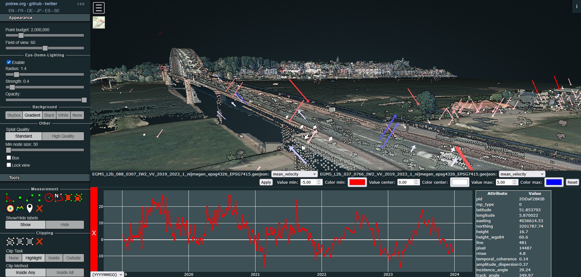
You can find the adapted Potree viewer here.